
Project Overview
Challenge
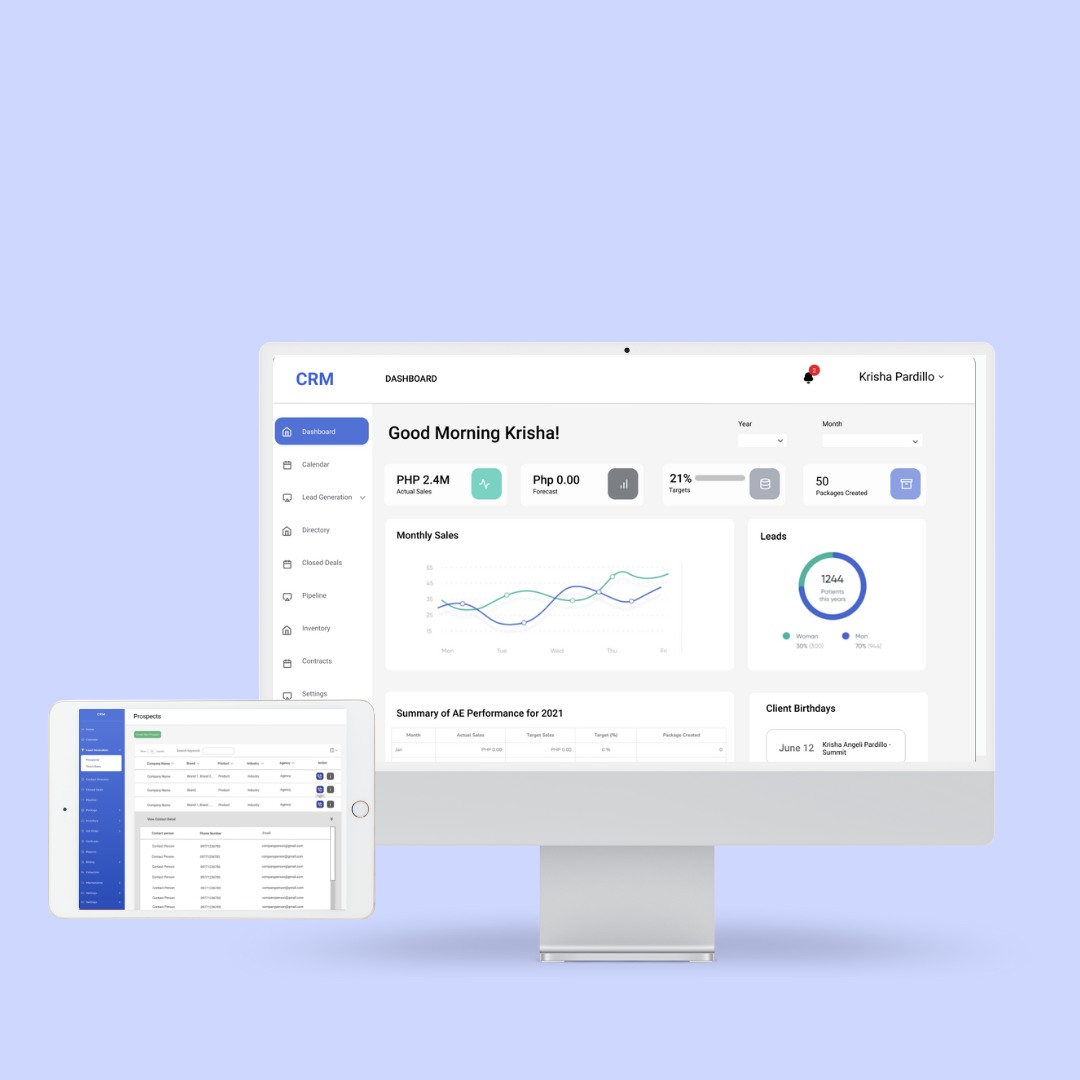
Summit Media's CRM aims to improve customer management. It allows storage and organization of customer and prospect contact information, identification of sales opportunities, reporting of service issues, and overseeing the stages of the sales funnel - all in one central location. Thus making information about every customer interaction easily available to the sales team or anyone in the company who might need it.
Objectives
Customer relationship management (CRM) is a technology for managing a company’s relationships and interactions with its customers and potential customers.
The CRM 1.0 redesign aims to significantly enhance user experience by addressing key pain points such as complex navigation, information overload, and inefficient workflows. Specifically, it will:
- Simplify navigation and improve interface clarity.
- Optimize workflows to boost task efficiency.
- Ensure accessibility for all user levels.
- These enhancements will result in a more intuitive and effective CRM platform.
Project Type
End-to-End Mobile App, Branding
Tools
Figma, Adobe Illustrator, Miro, Excel
Role
UX Designer (Research, Visual Design, Interaction Design, Usability Testing)
Team
Self Directed, with feedback from the mentor and peers
Duration
2 Weeks (80 Hours)
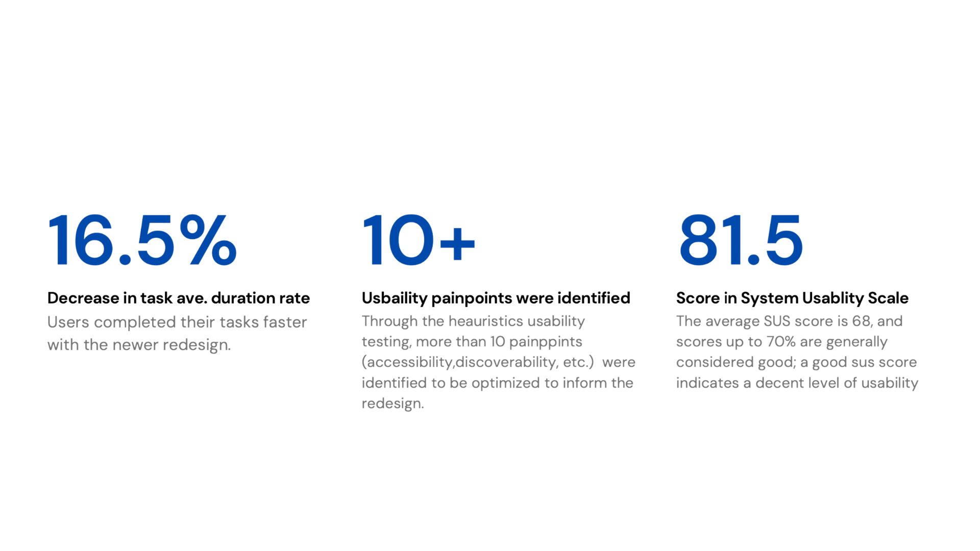
Results
Project Outcome
We've spent the last two quarters incorprating different UX/UI approaches to inform the redesign of the CRM platform.
Design Process
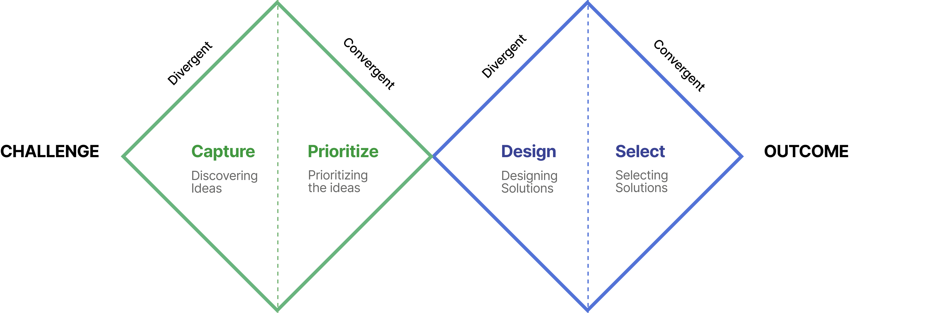
What issues or frustrations did stakeholders encounter with the current platform?
At the outset of this project, I felt it was important to identify as best as I could what aspects of the app user experience and user interface that users would largely like and dislike. To this end I set these research goals:
- Identify best practices for organizing information on the platform.
- Identify strategies for promoting more natural social interactions between users.
- Understand pain points that could make app usability difficult.
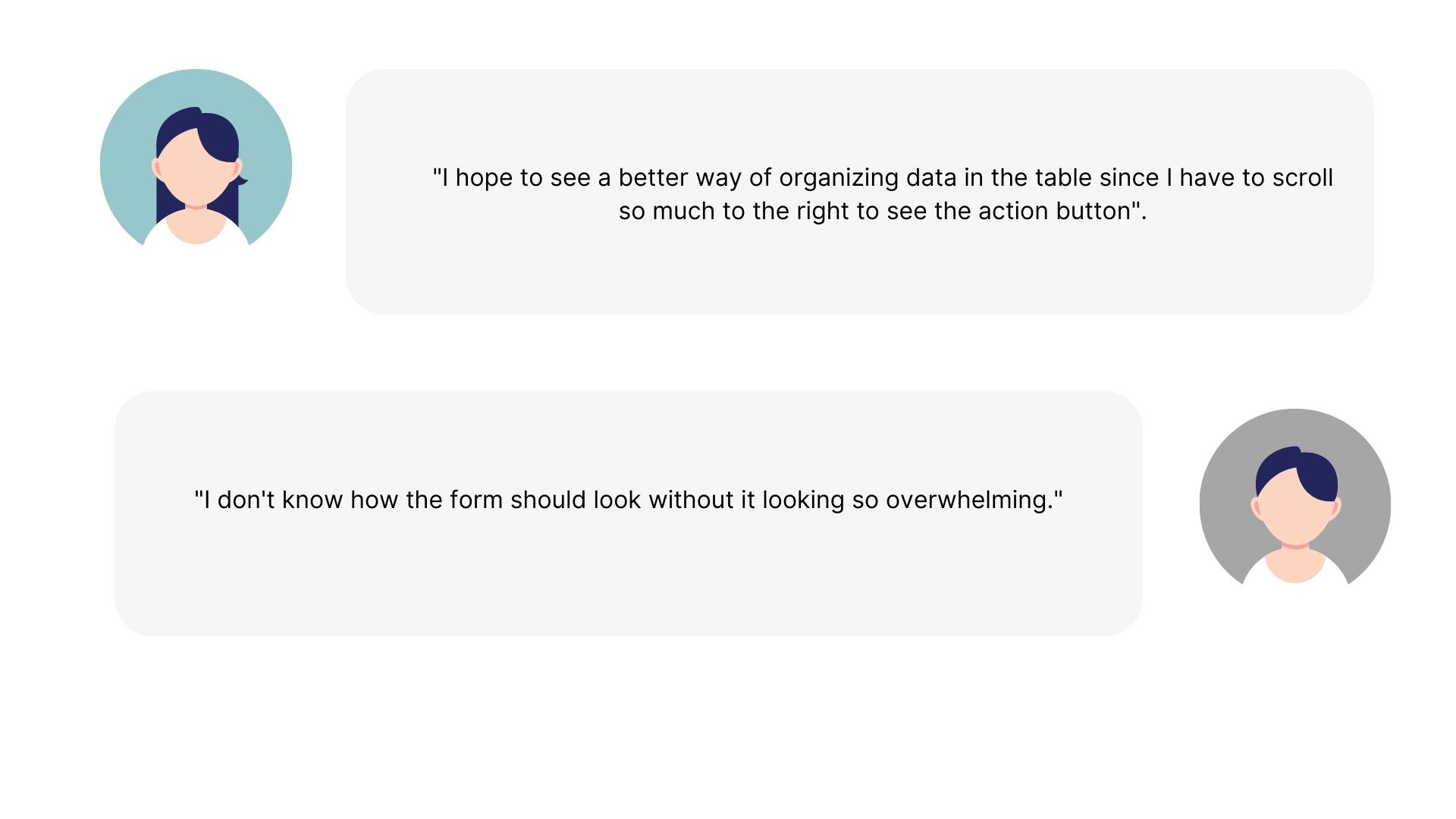
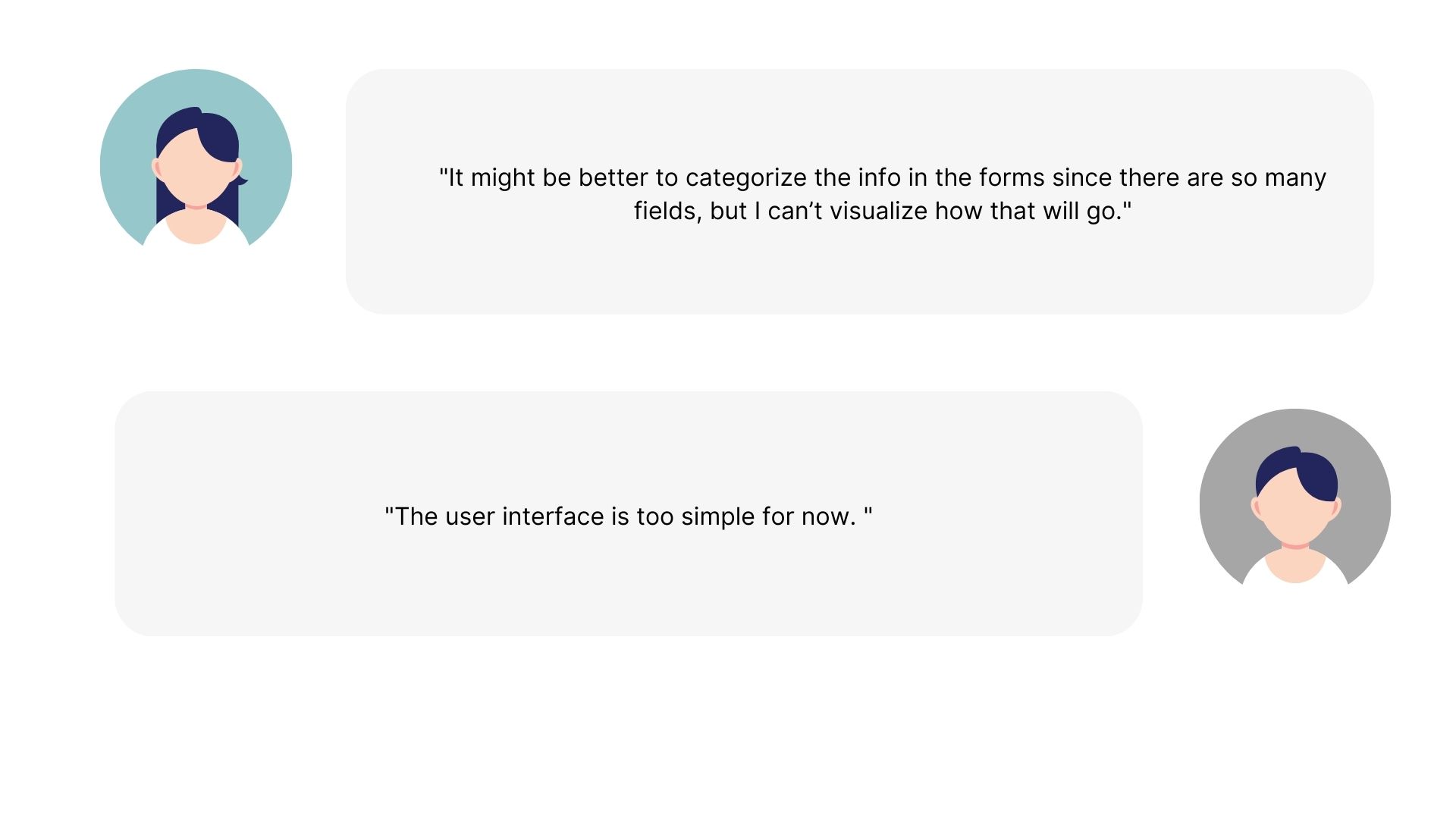
During the project briefing, the stakeholders raised their concerns in using the platform. Sentiments include:
Shortly after, I was given access and I started by immersing myself in the platform, freely navigating through it, and testing out the functionalities that are stated in the user manual.
Challenge
How might we redesign CRM 1.0 to create a seamless and efficient user experience that empowers users to manage customer relationships effectively?
I was to do user research regarding the basis of my design solutions and present it later to the team for further revisions or additional requests.
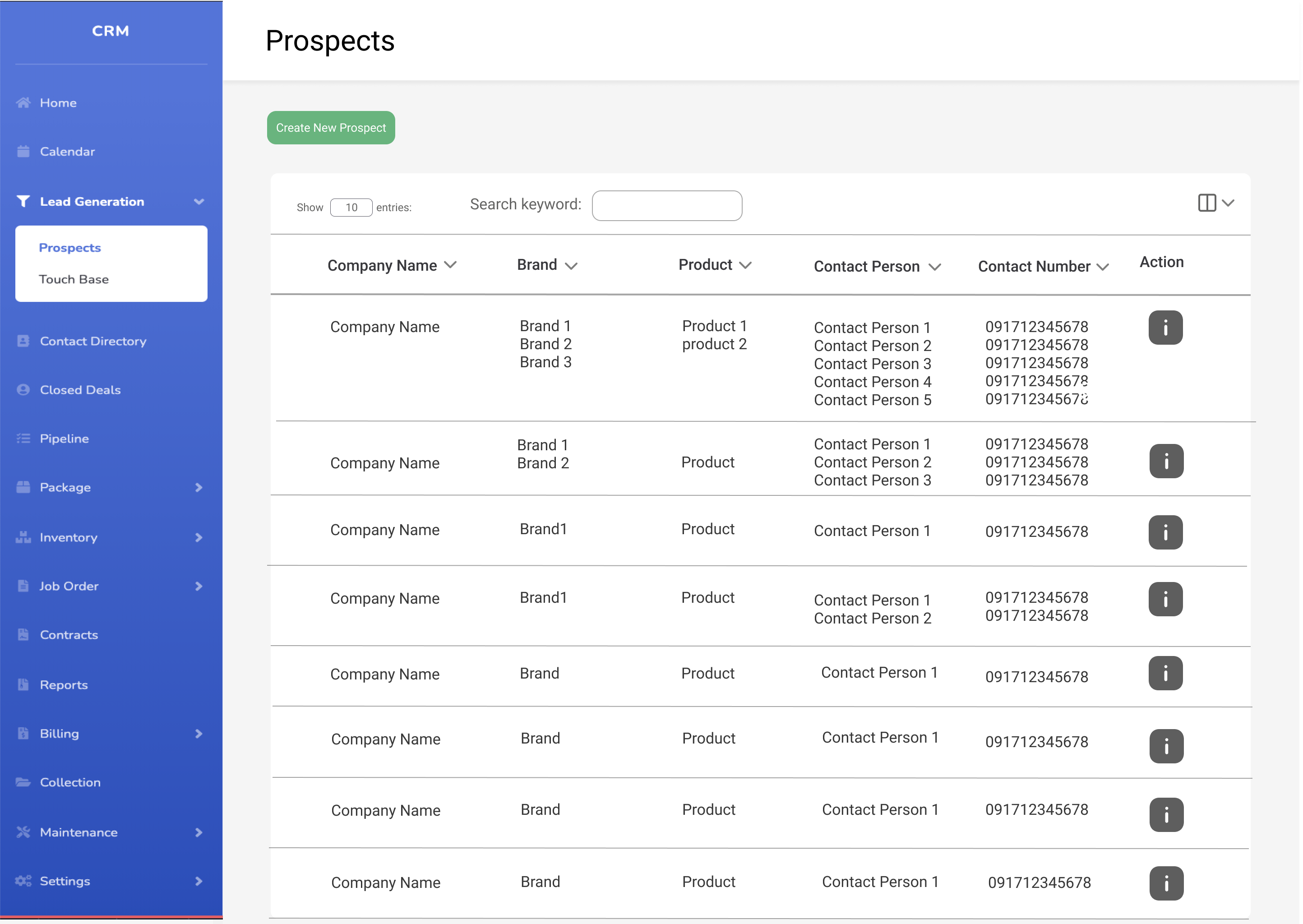
These are the existing screens of the CRM platform:
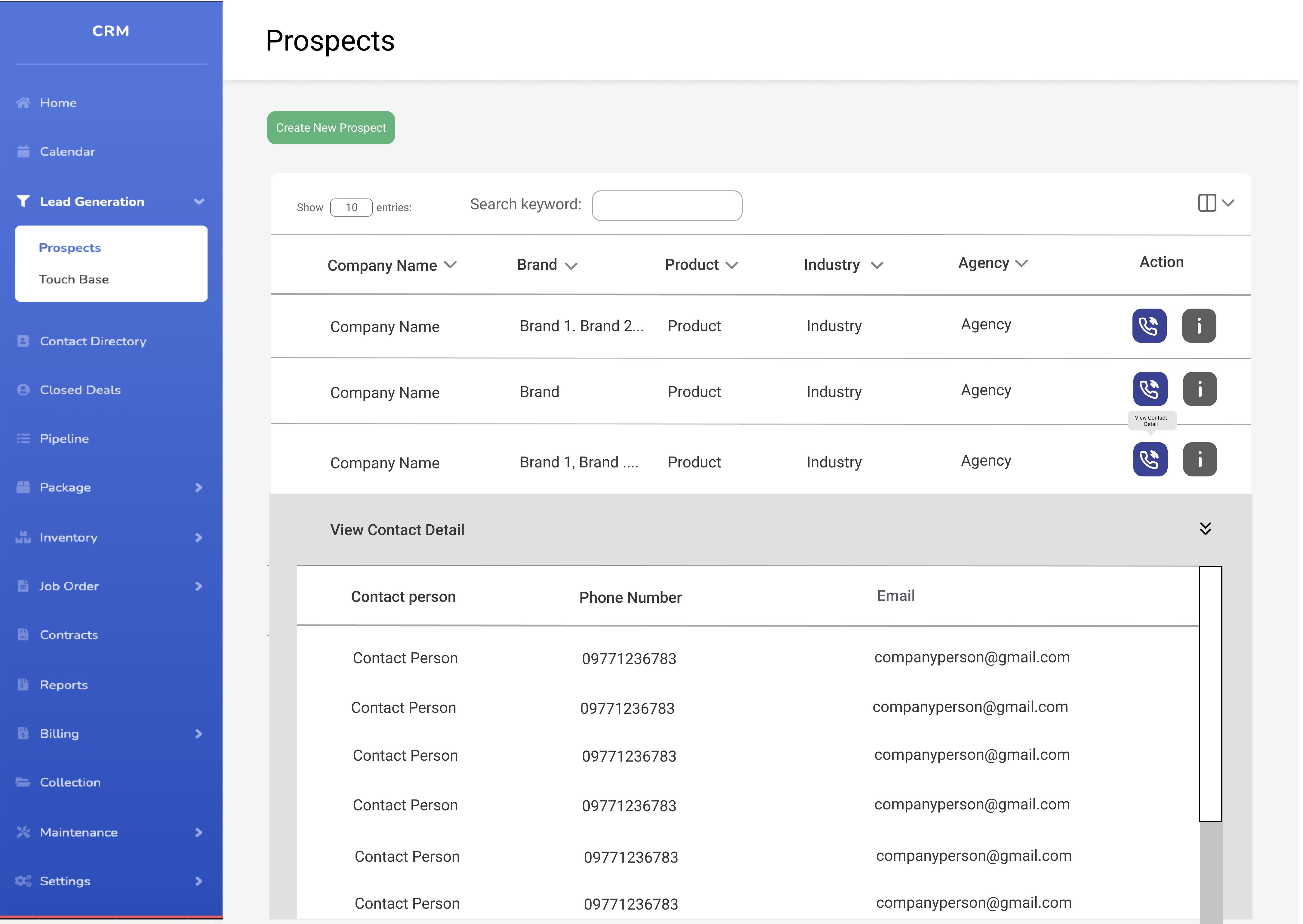
1. Tables
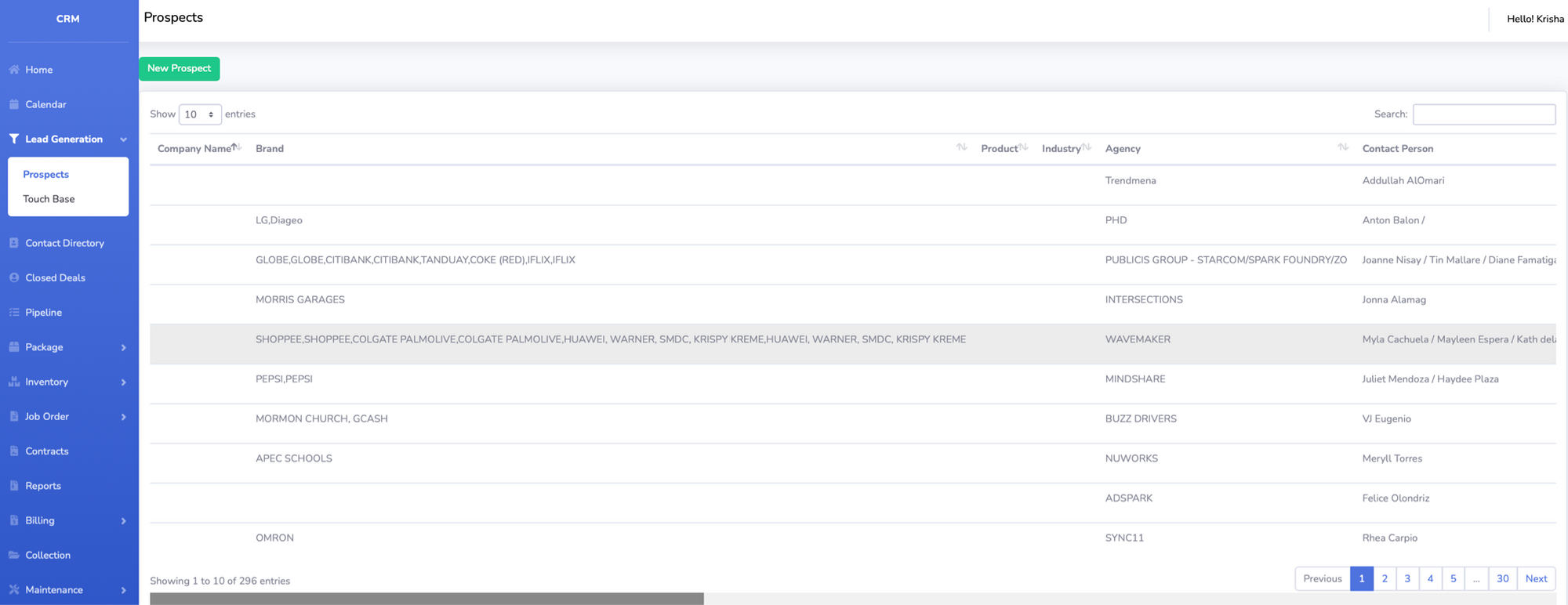
Observations:
- There are too many columns (10). This is one contributor to the need to scroll horizontally.
- Rows with multiple data are grouped together with just a “,” as a seperator.
- Difficult to trace which contact information are paired with which. Also adds to the length of the table.
- Contact information takes up a lot of length in the tables.
- CTAs have poor visibility/discoverabilty - have to scroll to the end of the row to see the action button
2. Forms
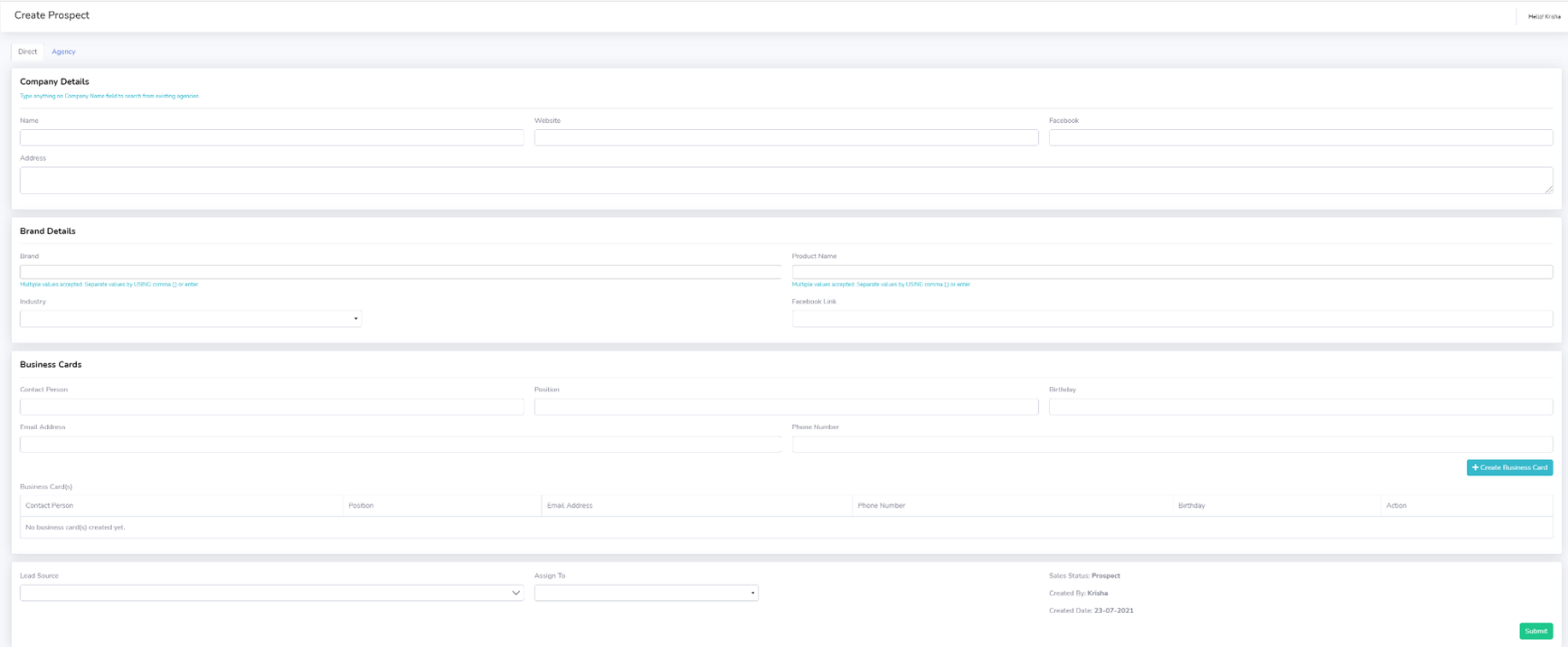
Observations:
- All the sections and data are all clustered in one page
- All the data does not fit so there is a need to scroll both horizontally and vertically to see all the fields
- There are so many fields at a glance.
3. Pipeline
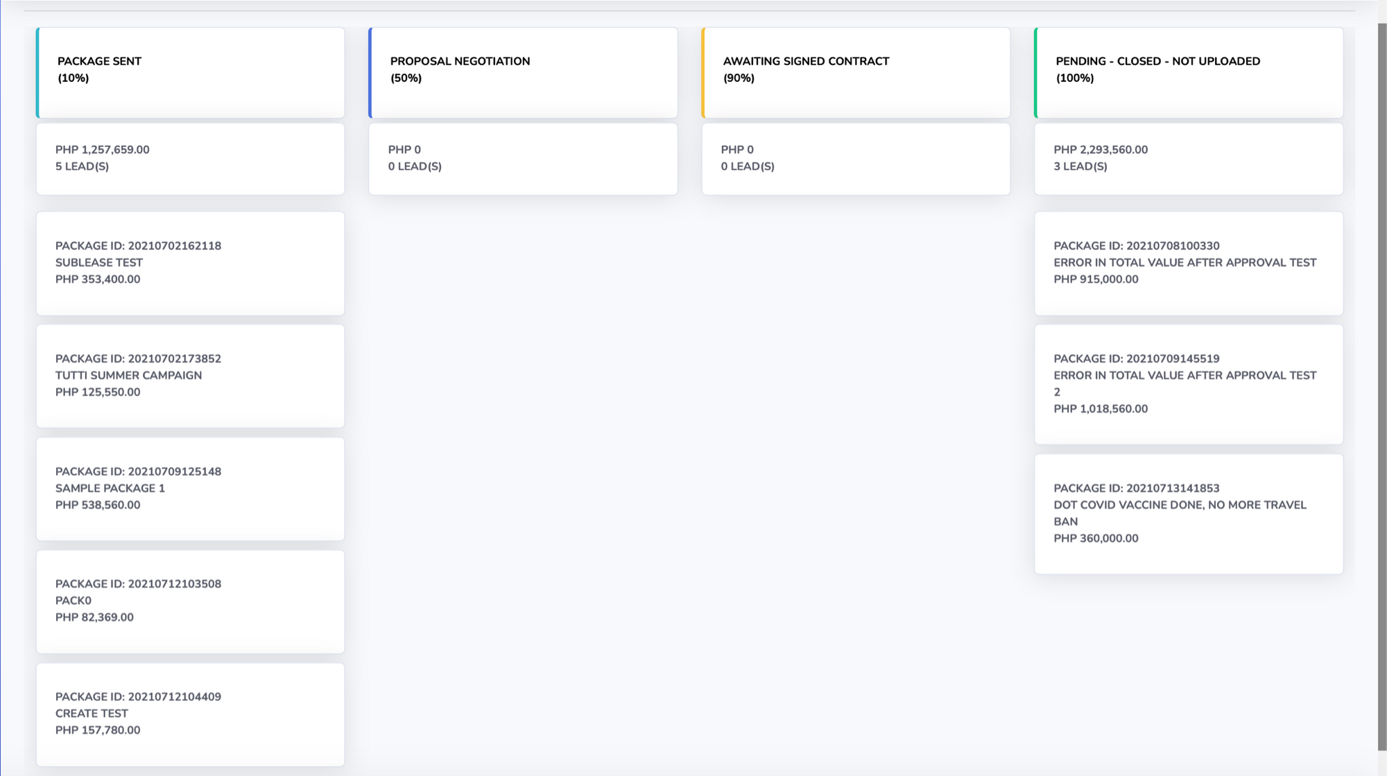
Observations:
- Title labels and actual content do not have any distinction from one another given that they are in close proximity to one another.
- Poor discoverbaility on the ability to click on the cards
- The style, color and size of the text inside the card do not provide visual hierarchy or importance
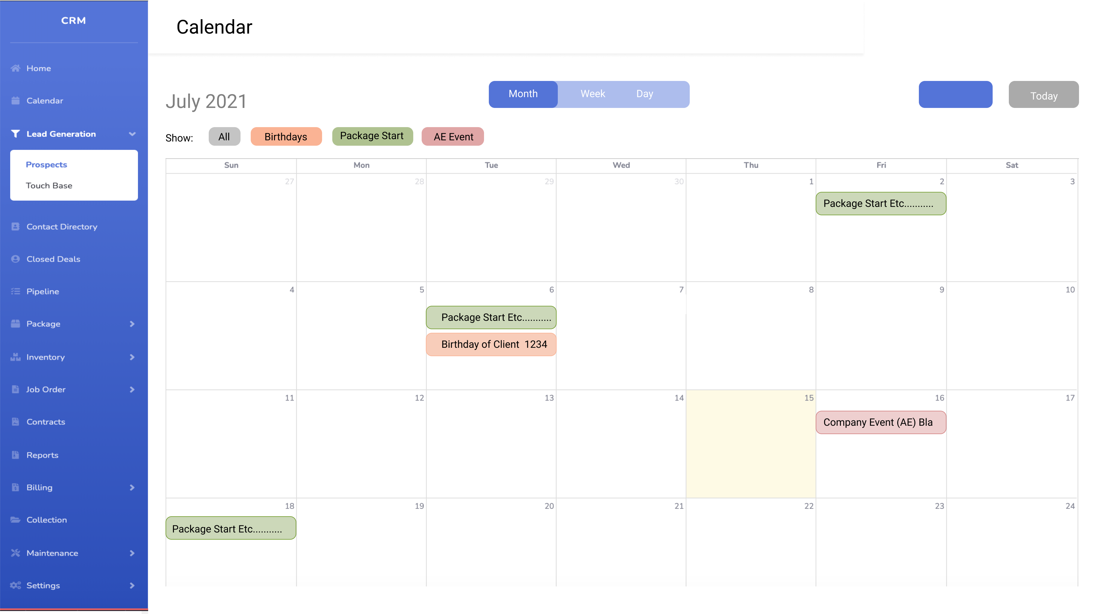
4. Calendar
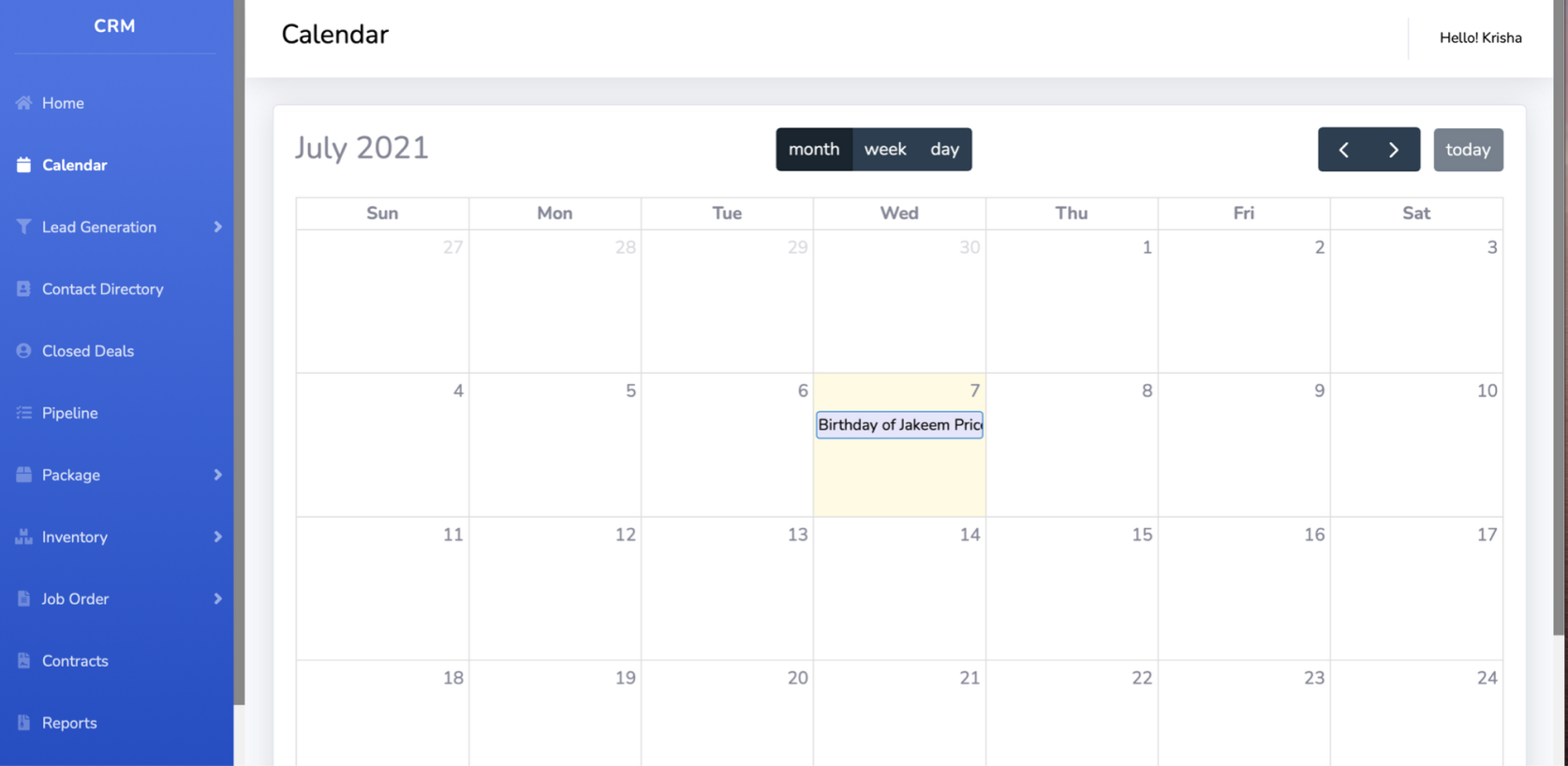
Observations:
- Different shades of blue
- No distinction on what kind of events
Heauristic Evaluation
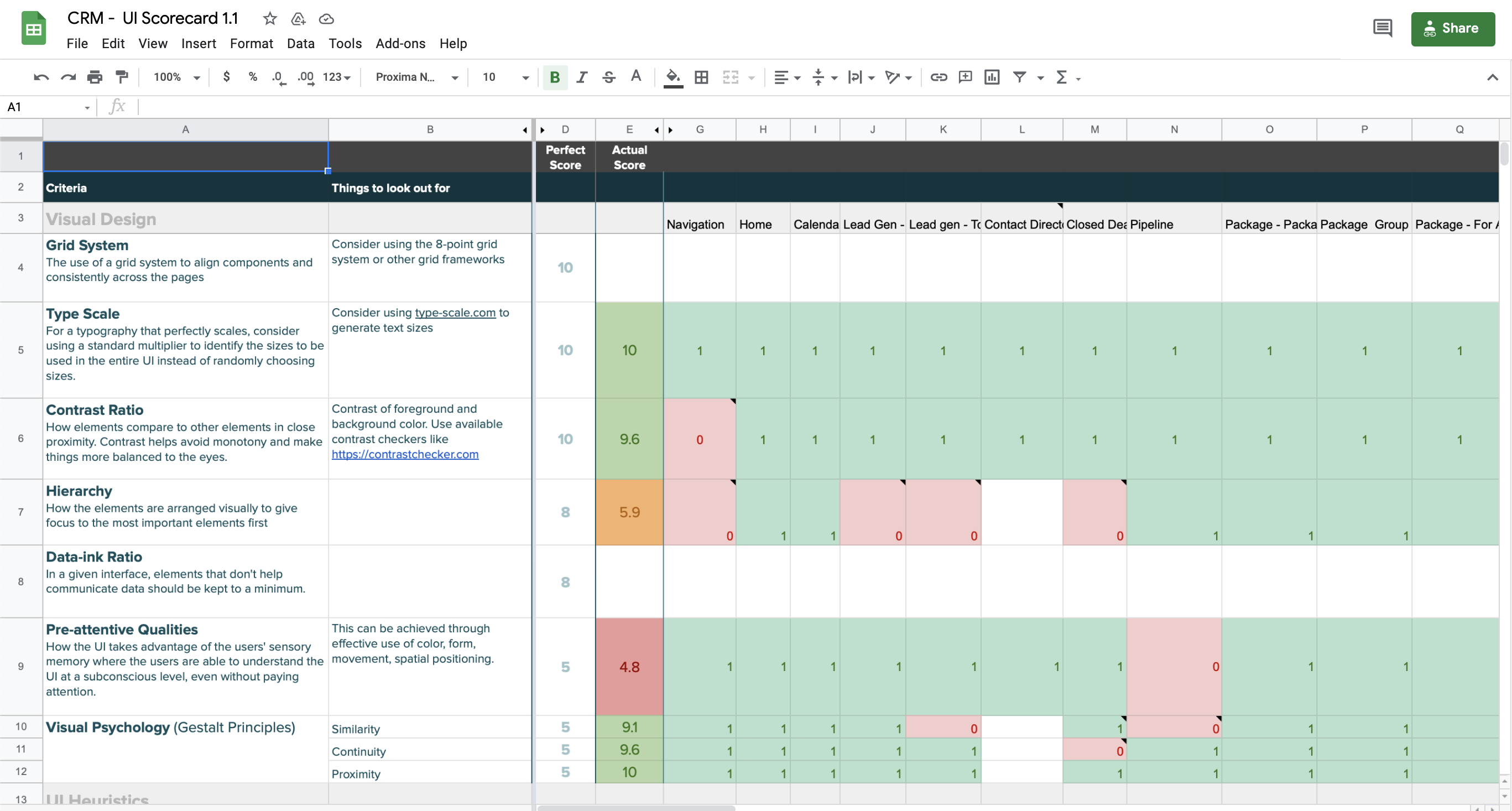
After I had a greater understanding of the platform and its functionalities, I proceeded to do an internal audit of the platform through a UI scorecard. This UI scorecard is provided by the company's UI Team. It provides a heuristic and visual design evaluation with the use of criteria and a scoring system. This also serves as another reference on which I can base off my data insights.
The Solution
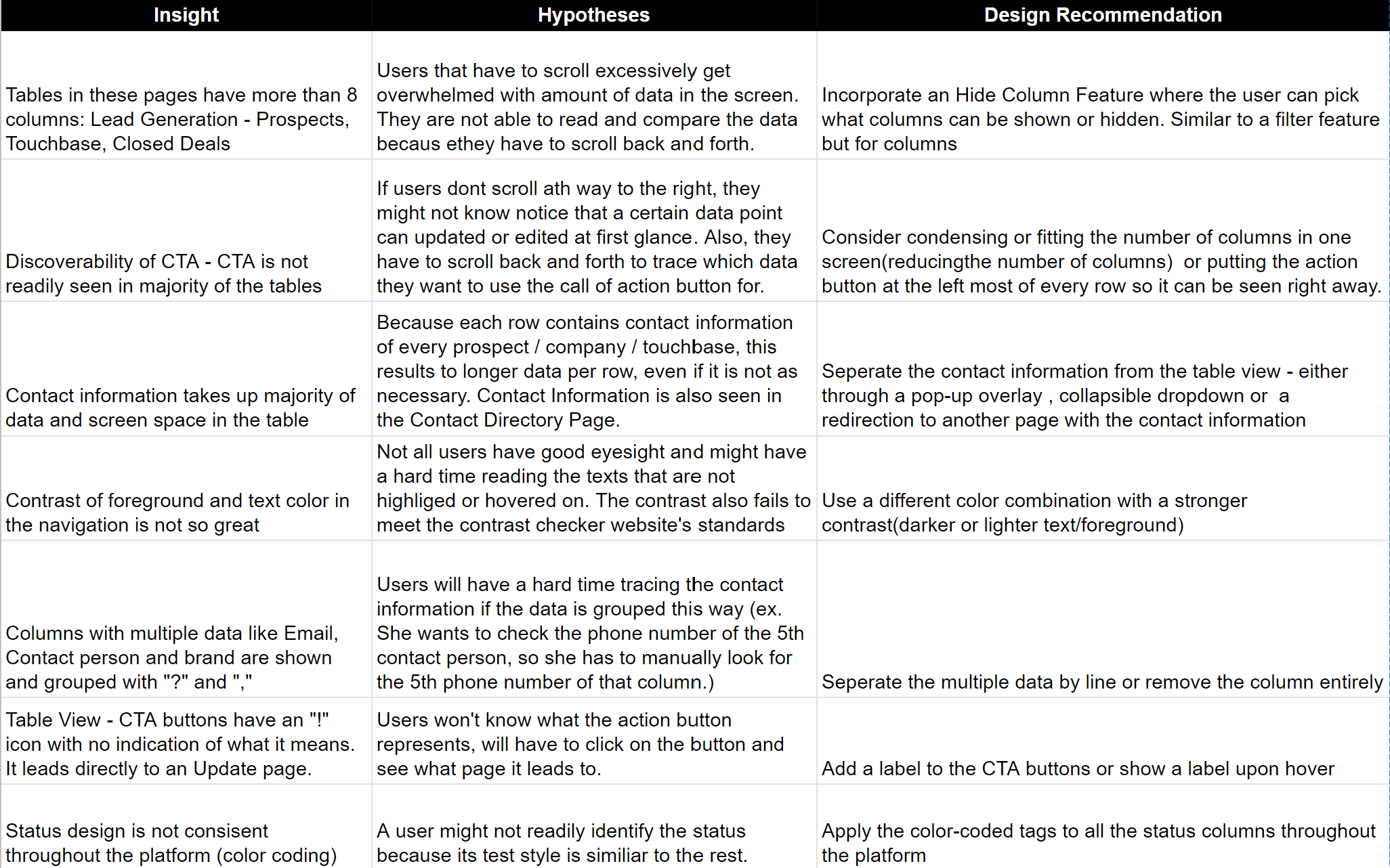
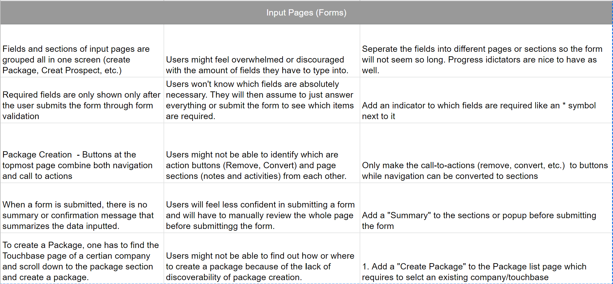
To consolidate all the research findings, I made a design map to give an overview of how each insight per element, supplemented with a hypothesis, leads to a design recommendation.
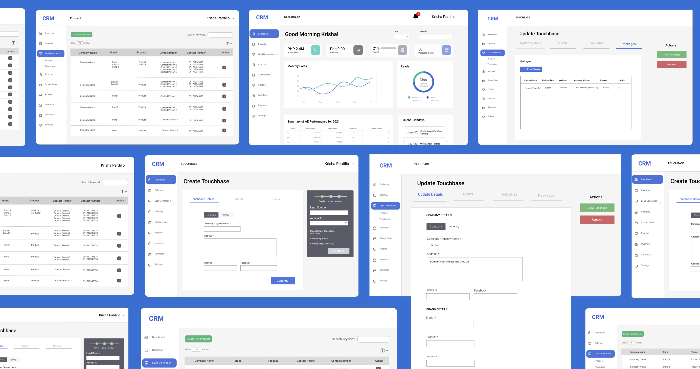
Wireframes
As requested, I proceeded to create the mid-fidelity wireframes with the implementation of the design reccommendations that I made. Since, I want to focus on the functionalities first, I made use of the existing UI of the platform.
To address the problems with the Tables, I created three options for the stakeholders to choose from as a starting point.
(1) To cut down the table length and theneed for excessive scrolling, I proposed a "column-filter" that can multi-select which columns the user wants to show
(2) Seperate rows with mutiple data by line to easily trace and distinguish data points from one another, without compromising the table structure.
(3) An collapsible thread under each row for lengthy details such as
contact information.

For the calendar, I made use of tags that distinguished and filters different types of events.
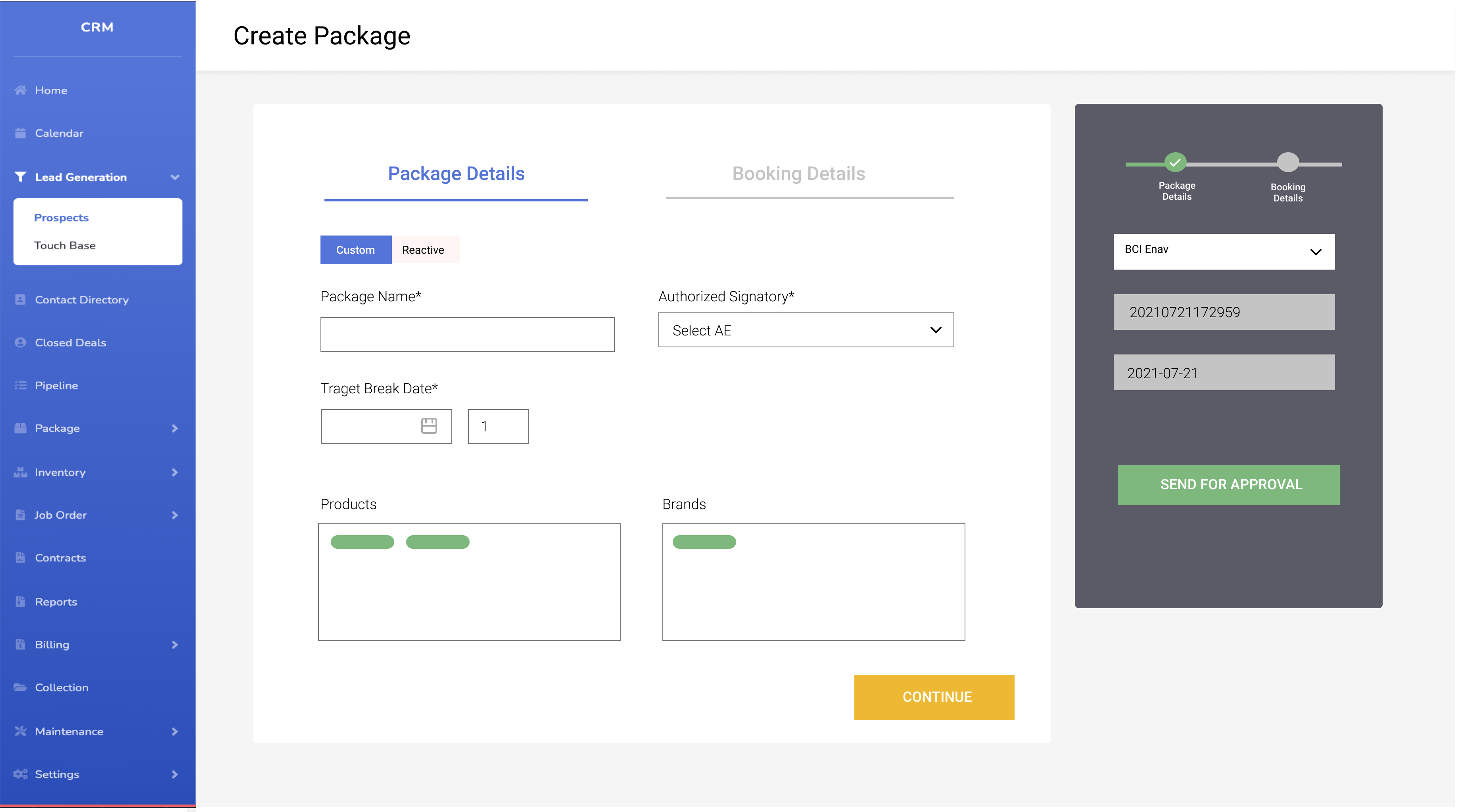
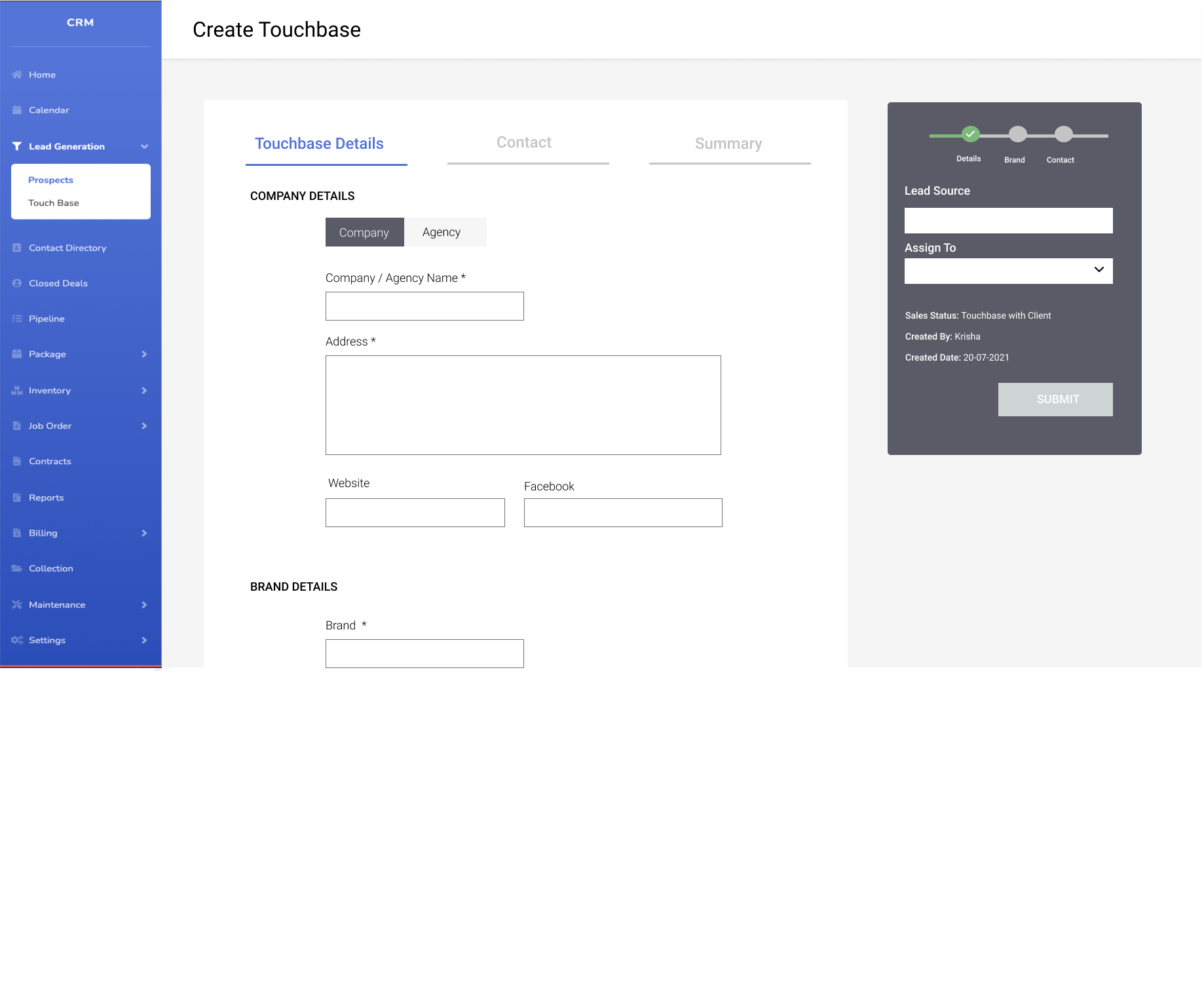
For the forms, I made use of sticky navigation of every seperate form to categorize and cut down the amount of fields in the screen. I also included a progress bar to provide more transparency for the whole process.
Let's jump to the UI
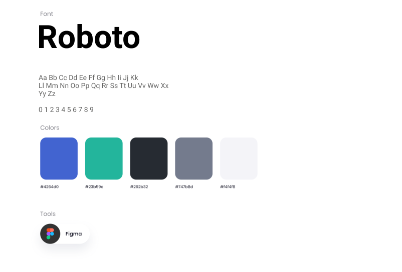
Presenting the new design style guide. This inspired by the current colors but refined to a better look
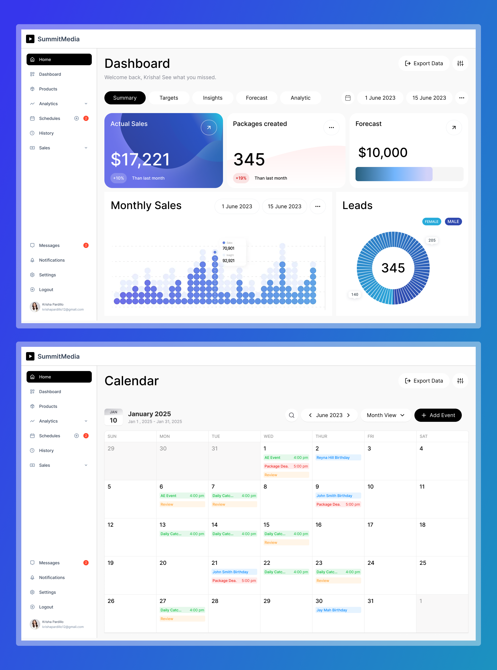
Snippets of the Hi-fidelity Wireframes
Note: These hi-fidelity wireframes closely represent the final implemented design. However, certain graphs and data have been modified to protect confidentiality under NDA guidelines.
Recommended Next Steps
Overall, this project was a lot of fun - being able to design at scale and applying UX design in a professional setting. I look forward to continuing to see how it evolves in the future. For the next steps I recommend:
- Solidify the research process. Interview more users to identify any additional painpoints or user goals.
- Research on the competitive landscape of CRMs in the Philippines and globally.
- After validating the design, I would hand-off the design to developers or other stakeholders to work on developing the app.
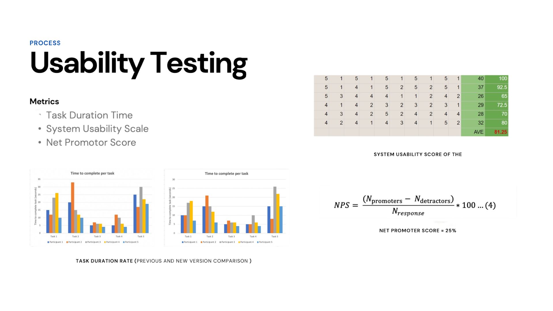
- Conduct a usability on my proposed recommendations and an A/B testing for comparing which different options are more suitable for the user
Takeaways
- I learned the importance of how communicating my design ideas is just as important as producing them.
- There is no design process that fits all.
- I can’t analyze a product’s performance subjectively. There is a need to base it off objective standards.
- The stakeholders were satisfied with my solution and thought it was a great start for their CRM redesign project. They will continue to iterate on it and make it better!

Interested in working together? Get in touch!
Krisha Angeli Pardillo
krishaangelipardillo@gmail.com
Selected Works
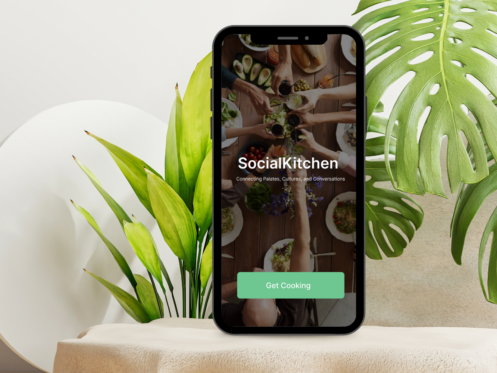
Social KitchenProject type
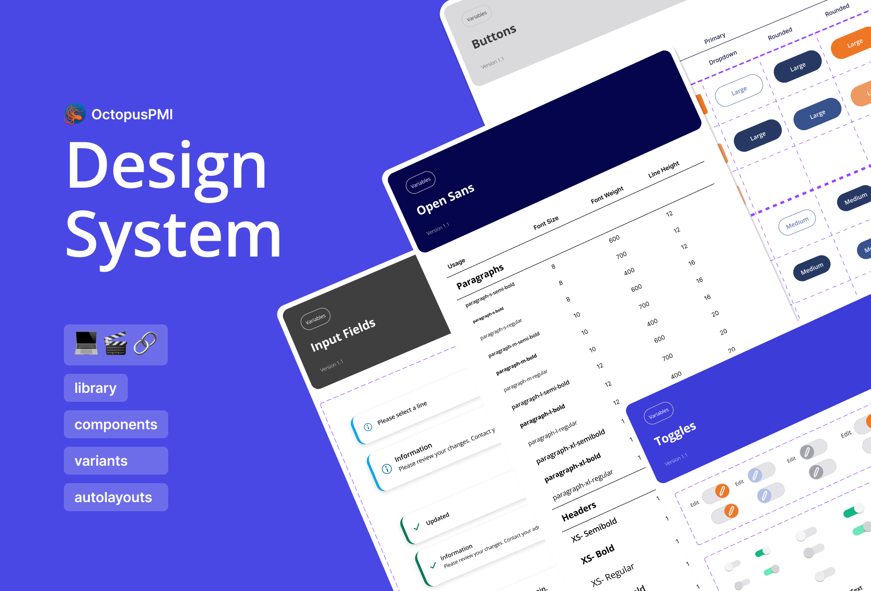
B2B Web Design SystemProject type
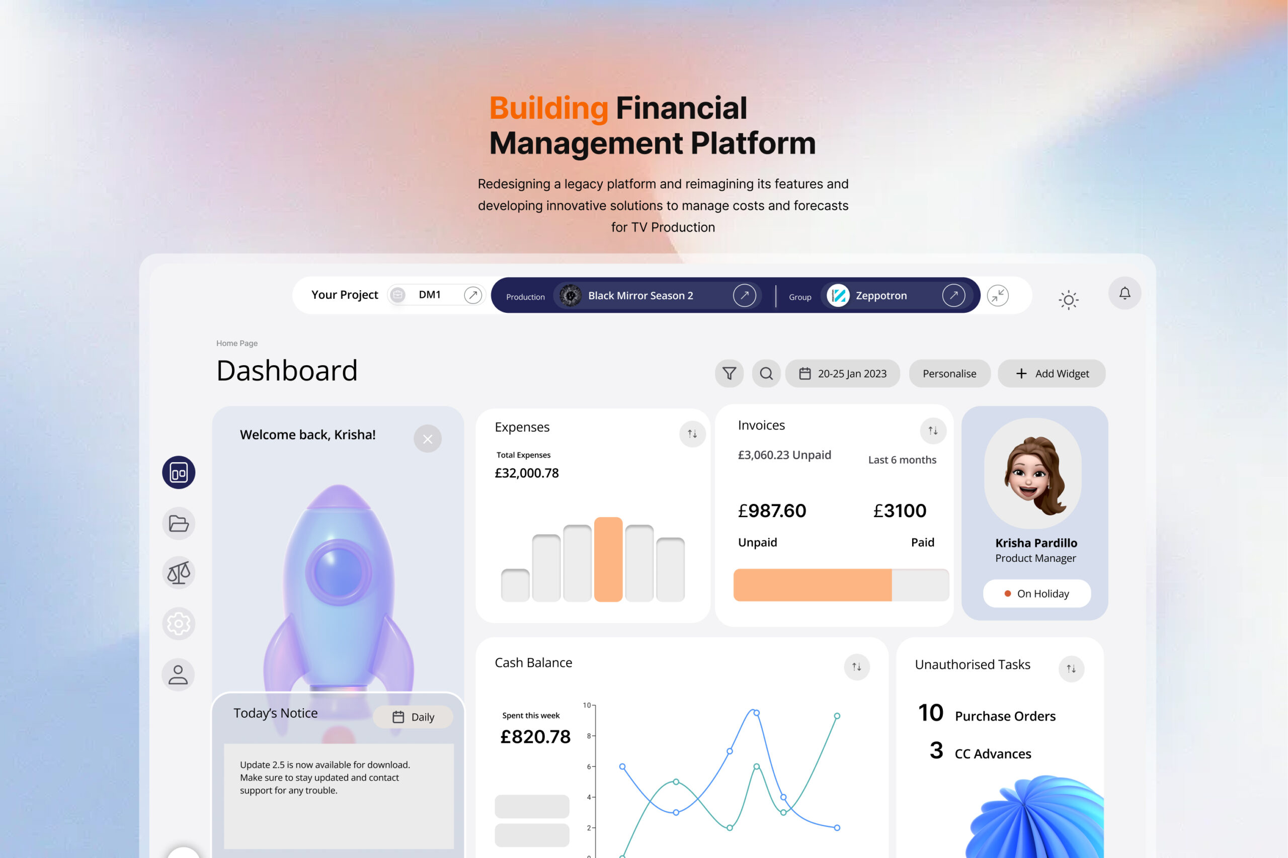
Finance Management ApplicationProject type
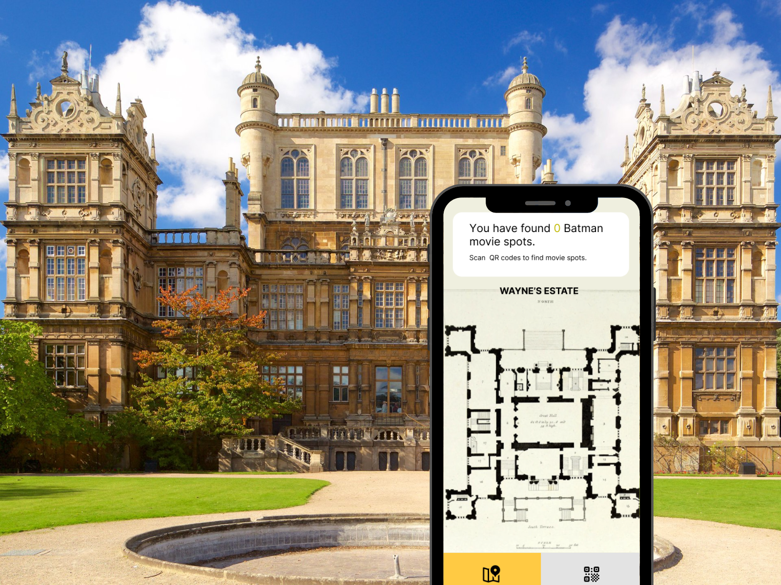
Finding Batman AR gameProject type
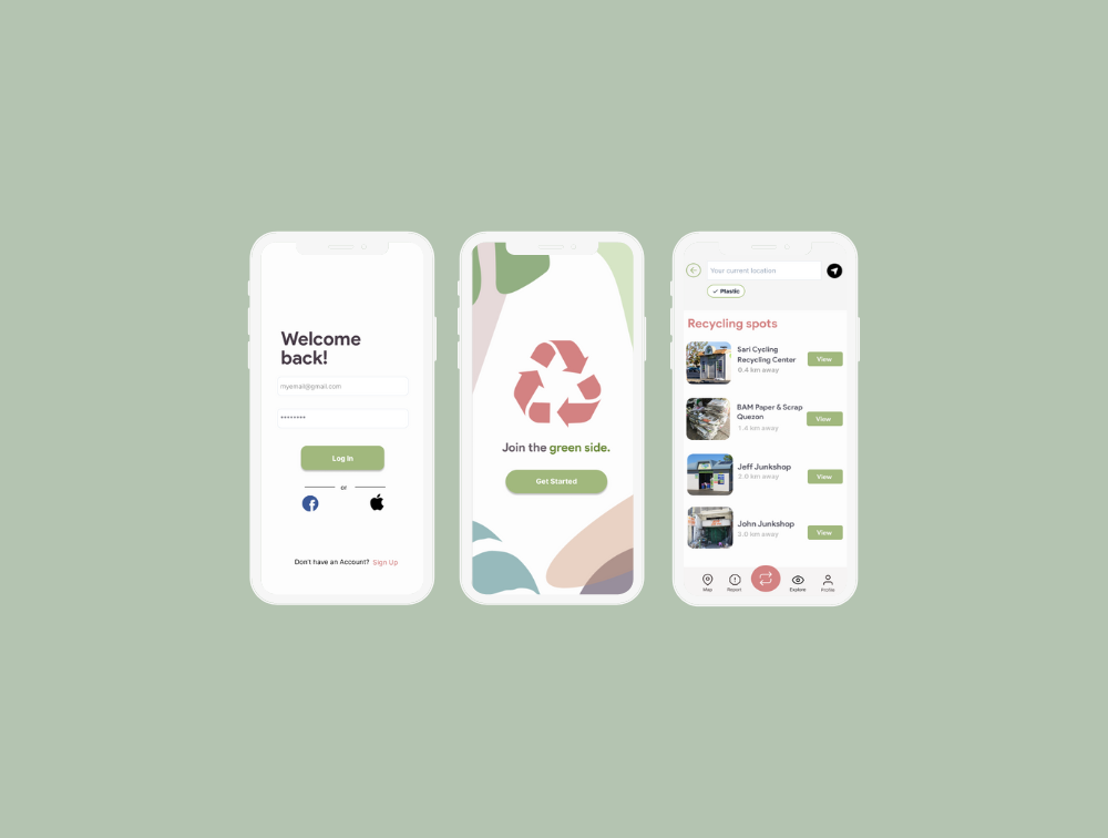
GreensideProject type
CRM PlatformCase Study